
Best practices in landing page design
Reading Time: 3 minutesAh yes, we have all come across landing pages at sometime or other. Many product related, some showcasing the next big ‘thing,’ while others are perhaps unexpected with incredible discounts on offers that only make you ‘groan’ and demonstrate the power of how a landing page can ultimately fail.
Whatever the case maybe, there is no doubt that landing pages contribute to successful inbound marketing campaigns. They are the focus of lead generation and target specifically on a market as a result of SEO, PPC, social media or content marketing campaigns. The question is, does the landing page perform well, making the reader want to move on to the next level? To ensure your visitor takes the best next step, we have pulled together a list of landing page best practices.
Convey the message quickly!
As most of us are visual and tend not to become distracted by unlimited content, we estimate you might have about ten seconds (if lucky) to communicate what it is you are advertising to your potential client. Landing page design headers and subtitles should be tastefully designed with great typography and clearly define its message, following up with a short bullet point list of whys and hows. Highlight content that should call attention to key areas and try to avoid any unnecessary links that might take your visitor away from the page. Yes, we recommend only a few call-to-actions (CTA), and they should not be leading to unrelated pages.
The Call-to-Action (CTA)
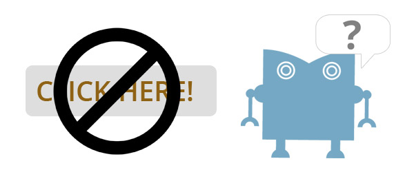
A call-to-action is the key area to encourage potential client contact. Typically, a submit button of a form (or leading to separate form), the CTA should complement its landing page design. This may be a accomplished by the use of stylish CSS and contrasting colors. We want to visually communicate that the element stands out in comparison to its surroundings. Avoid shades of grey, white, even black in some circumstances, but instead make use of primary colors such as red, orange, blue with a slight edge (shading, slightly animated in HTML5, etc). Finally, avoid simple actions such as ‘View More, Click Here, Submit’, but more in the lines of ‘Download my coupon book’, ‘Start your trial’..and so on.
Less is more
Design should be simple and most certainly not cluttered. There is no reason for pages of content, it will only distract your potential client. It certainly would become more of a problem with smart phones, the landing page may scroll too much and become more of problem.
Follow through with consistent company branding and establish that your potential client remains confident with your company. Too many times are landing pages created outside the brand environment and simply state that the landing page was outsourced, appearing ‘clumsy’ and perhaps outdated.
Trust, loyalty and guarantee
Does a TV advertisement suggesting how losing 30 pounds in 1 week is very possible, or the next step to becoming wealthy is by ‘starting today’ sound familiar? Most definitely an example of what is not a good strategy with landing page design. Our suggestions would to be providing testimonials, social media feedback or case studies. It is quite easy for your reader to realize the validity of a social media reference (backed up with some analytics) than something that does not ‘sound’ quite right.
Final thoughts
If landing page design is something that your company needs, try time4design out. Ironically, with have included this rather handy call-to-action. Just in case you might need that extra level of attention!

- BY t4d editorial
- IN Design, Inbound Marketing, Web Design