Web Design Trends 2017
Reading Time: 4 minutesIt was 2011 when time4design decided to start the web trends series, discussing what could be on the horizon in modern web technology and what our current and new clients should expect next.
Web trends are quickly evolving from one idea to another. In 2016 we have witnessed some incredible development, but with all the excitement the focus has clearly been with user experience (UX). The overall experience of a person using your website or application.
Let start off with a very known area discussed in practically all our articles to date, and that is of course responsive web design. This trend is now certainly expected from most websites, however could there be more to it? What if this tailored experience adapted to the user?
Age-responsive design
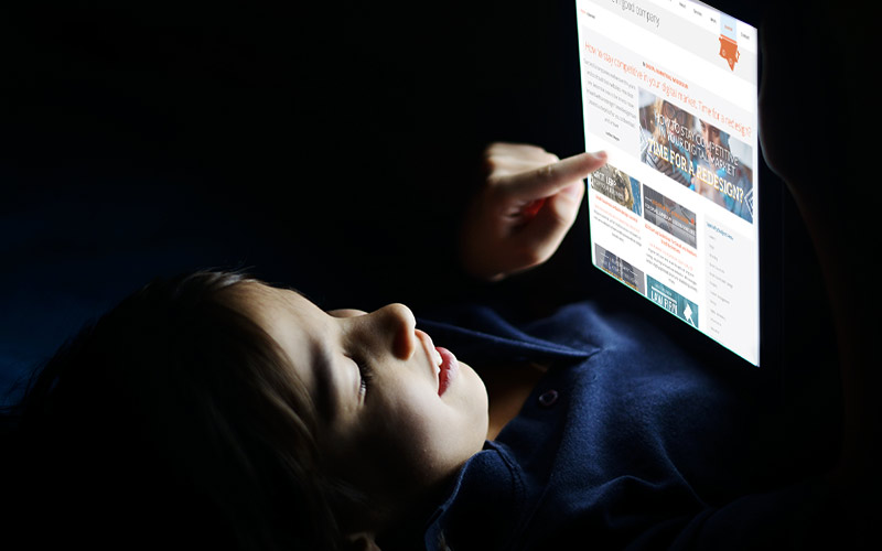
Websites adjust to a specific device, yet this exciting design concept will factor in age demographics. In combination to ‘how’ a website should look, age-responsive design will consider ‘what’ content to display. It’s an exciting thought! The known fact that one website fits all will change as we know it.
Children and adults will be faced with a unique web experience, with the potential of using different interfaces based on their age group. Take for example a young teenager viewing a site that might have, vibrant, saturated typography, while perhaps the older generation see a website with muted palettes and larger type faces.
It is forecasted that in 2017 that metadata will inform age-specific adaptations. This will include age-responsive navigation menus, font sizing, and color schemes.
Interstitial Anxiety Optimization
Anxiety caused by a website? In more plain terms, this refers to the delay when taking an action and receiving a response. For example, the slight delay when deciding to click on a button and waiting for the results. Should a website have poor page speed and performance, loading times can create user anxiety with a heightened likelihood to move onto something else such as a completely different website! So what can be done?
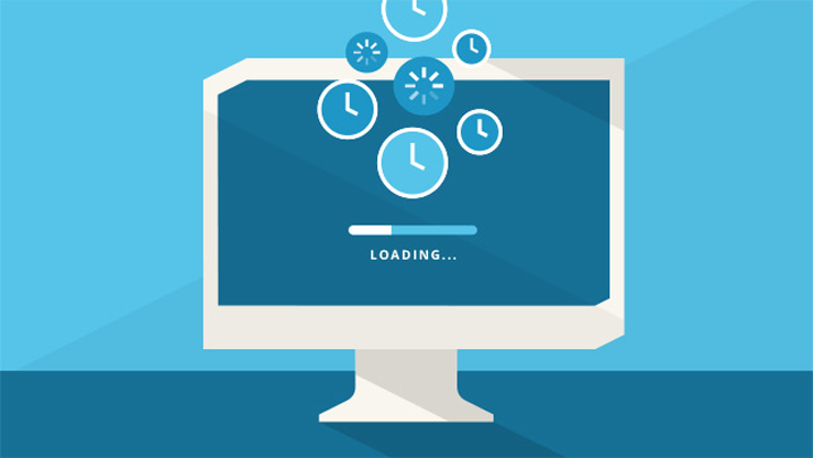
Web design is taking a shift and using such novel ideas of transitioning the user onto the next screen. Such an example might be a small preview of the site, a loading animation with useful information, or perhaps something completely unrelated, but enough to capture the constant attention of the user. It is obvious that a user will not wait forever, but it does capture the continued interest to stick around a little longer.
UI and UX Frameworks
Responsive design has been the front runner of simplistic design and with the increasing usage of such CMS systems such as WordPress, the impact it has had is quite noticeable over the years. Many sites are obviously sharing the same grid architecture ‘look’, and come across quite similar in appearance. How creative a website is ultimately will come down to the skills of a web designer, but UI and UX patterns have become increasingly web friendly as more brands adapt to similar architectures and enhance their user experience.
Authentic design will stand out over all.
2017 may show more of this unified approach as each business attempt to stand out in the crowd. Authentic design will stand out over all. Originality will become representative of who a company really minimizing the use stock photograph, video and icons to appeal to the user on another level.
Enhanced UX design will also benefit SEO, as websites page speed are increased due to enhanced navigation. Google has clearly communicated favoritism to sites with good load times and mobile optimization.
Micro-interactions
Micro-interactions have been quite common since 2015, small on-screen animations that play a significant role in UI and UX design. They allow users to understand in three processes, what will happen, what is happening and what to expect next. Such popular examples include Facebook ‘like’ or perhaps a download menu option, from first click to a completed result.
Expect to see this trend continue in 2017 as designers come up with more creative ways to enlighten our web and mobile experience.
What we will see less of in 2017
Mentioned earlier, users are beginning to tire of overused, ‘seen it before’ stock photography. Purchased stock photography is another vision from someone else, even if used tastefully, whereas custom photography cannot be compared with. It is a complete representation of your brand.
Carousels or animated slideshows will start to diminish due to performance related issues, and severely impact SEO. At the same time, we may also witness less parallax scrolling for similar reasons, yet however it does create a very positive user experience in regards to storytelling and demonstrations.
The fold will final be a thing of the past as users finally accept intuitive scrolling. The idea that it would be possible to try and fit all information above the fold can be an impossible task for designers. That being said, key information at the top of the website is still relatively important as long as overall user experience has not been impacted. For example, a large ‘hero’ image with nowhere to go certainly would not be the ideal solution.

- BY Wayne
- IN Responsive Design, User Experience, Web Design