
Simple lead generation website design improvements
Reading Time: 4 minutesEngaging you target audience is vital, a successful website requires ongoing upgrades and new ideas to improve lead generation and sales.
This of course should not involve any kind of website redesign, lead generation is so much more than design appeal. With just a few simple enhancements to your website there are various methods on driving new clients to a successful conversion
Improved Contact Forms
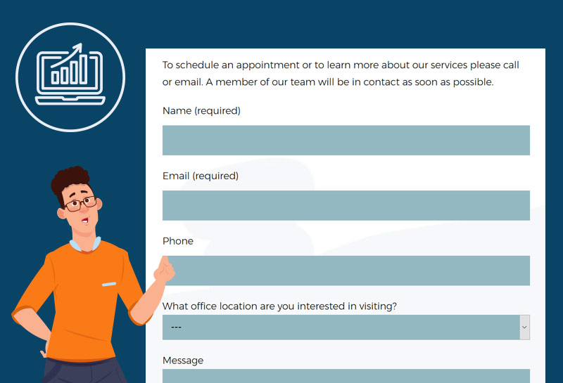
Lead generation contact forms are a method for your client to reach out for more information. A well-designed form is imperative, and although you may think your current form may not need improving, it is worth taking a second glance.
In general, it is best practice to ask for the least amount of information as possible, a simple contact form has a higher probability of conversion, rather than a form that looks so complicated and extensive, resulting in abandonment. Fine tune your form by following some simple techniques.
Limit the number of fields
Only important fields should be part of your form, such as name and email address. Combine fields if possible, so rather than ‘last name’ and ‘first name’, simply use ‘name’.
Reduce Required Fields
Try not to make every other field required if possible, only require the essentials. Where it might make sense to you that a phone should be required, it may also lead your prospect to think that they will be bombarded with telemarketing calls. Email tends to be a safer form of communication for most, after all, had your prospect wanted to talk, they would had called you. For fields that do need to be required, make sure that the form design clearly communicates errors. Consider your target market and be aware of compliance.
Understand the use of CAPTCHA
Does your form truly needs a CAPTCHA? Yes, an excellent method to fight spam, at times may actually decrease conversions as proven by this CAPTCHA Conversion Rate Study. Spending a little extra time, monitor emails in order to avoid spam. Try a short test with your own form, if removing short-term appears to approve your conversion rate, it is well worth keeping it silent. Discuss with your web designer other methods to best combat spam.
Once a lead has been received, always remember to acknowledge immediately, communicating perhaps with an autoresponder or landing page that informs the prospect that the form was completed correctly. Good customer service create happy and loyal customers.
Calls to actions
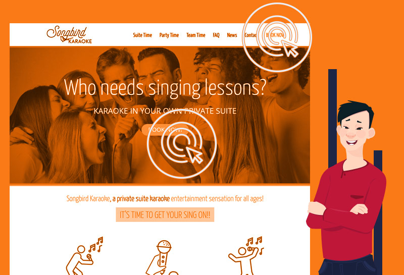
A call to action (CTA) should use appropriate language to communicate effectively what step it is that will be taken next. Instead of using such generic terms as Learn More, Submit, Contact Us, think creatively and add some personality to your CTA.
- Contact our team to schedule
- Download your web design marketing report
- Schedule a time for us to call you
An intuitive CTA helps gain higher conversions as your prospect will know exactly what is expected.
Calls to actions should be large enough for your prospect to see and placed within an area of your website that has high visibility. Good UX Design makes it easy for visitors to covert. Examples might include highlighting a menu item such as ‘Book your next event’ or created a fixed menu bar during scrolling
Analytic data from tools such as heatmaps and clickmaps can provide valuable information to demonstrate user behavior, where software such as HubSpot integration or using WordPress Plugins as Inbound Now, can provide trackable data valuable for use with future CTAs and updates.
Place and position
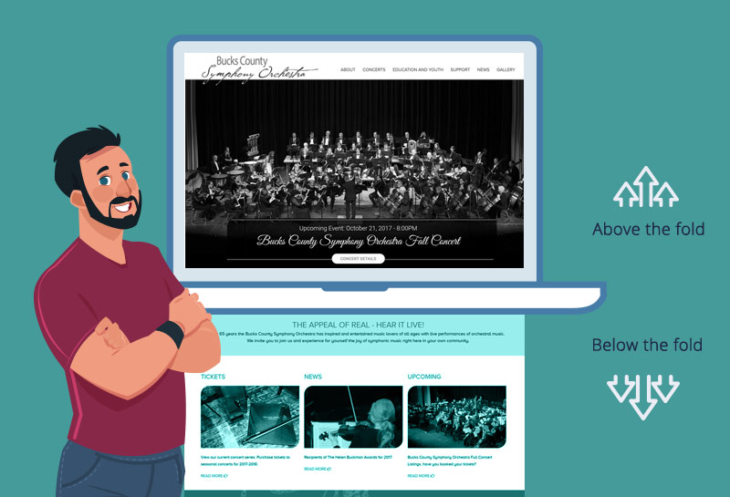
For new prospects visiting your website for the first time and perhaps not familiar with your brand, we need to consider simple value proposition. The general idea is that elements above the fold will get the most attention, that is, they do not require to scroll to see further information. Above the fold term originated from the world of print, the upper half of a page such as a newspaper. It is a best practice to make sure that your call to action is in this visible area as it clearly explains the value proposition and signals to the prospect that there is still further valuable information, whether that is on another page or below the fold.
The call to action also needs to be carefully examined, we certainly do not want to waste this precious area by states such as ‘Over 10 years of experience’ or ‘Welcome to our website’, bur rather have a immediate response in the lines of ‘Try our product for 30 days’, or ‘Contact us now for quotes’. You will find that such simple changes will allow your prospects to engage further, staying longer on your website.
Final thoughts
Simplicity is the answer to drive engagement. Reviewing your current contact forms, call to actions and how they are placed will no doubt help you gain more conversions. Of course, time4design are here to help, so if any of this might need our assistance, perhaps now is a good time to contact time4design for an opinion.

- BY Wayne
- IN Web Design