Mobile, Touch, & Responsive Design
Smart Choices
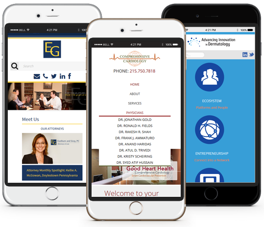
Having an innovative web experience is crucial, time4design can help you explore endless opportunities by providing a version of your site that has been professionally designed for devices such as mobiles and tablets.
Responsive Website Design
Responsive Web Design allows us to create a flexible layout that dynamically will be catered for all devices at any resolution. As the user switches from their desktop to smart phone or tablet, the websites layout accommodates resolution, image size and style. You might have noticed this with time4design's website, just try adjusting your browser size as it responds to various sizes.
Its this a requirement?
Businesses should absolutely concerned if a current website is not reposnive to devices. Users are inundated with many options and know that if something cannot be found, they can quite easily move onto another website - which means losing potential sales for a business.
Google ranking factor
Mobile-friendliness has been a Google ranking factor since April 2015, however as of May 2016 Google did increase the effectiveness of its mobile friendly ranking indicator. Google states that a website can still rank well if it has strong, relative content, but it is still recommended to go mobile.
Smart Answer
We bring together our in-house expertise in planning, design and development to deliver you and powerful, usable, fully responsive design.
Call our Doylestown office to discuss how we can help on 1(215) 766.7885, or email us. We consistently deliver engaging creative solutions, on time and within budget.