More than just a website footer?
Reading Time: 3 minutesA footer can convey a lot about a website. For those of you who may not already be familiar, a website’s ‘footer’ is located at the bottom, holding quality content relative to the business. Its design potentially can complement the rest of the website, engaging visitors to navigate to other points of interest.
It has been debated over the years that the footer really is wasted real estate, with only an estimated 20% of visitors scrolling beneath the fold. However, with increased usage of smart phones and tablets (to exceed usage with desktops in 2014), designers realize that the importance of the footer has become much more significant, as users do not have to scroll as much now as they did in the past.
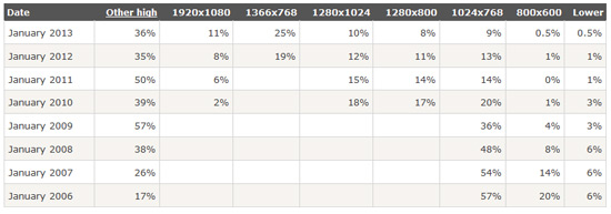
With larger screen resolutions, the fold is harder to pinpoint.
So what makes a great footer?
Personally speaking, the footer tends to be a favorite area to think ‘outside the box’, it allows you to really engage your target audience. The key areas I ask myself:
- Is it creative, organized, & simple?
- Are we using quality content and links?
- Are we meeting usability standards?
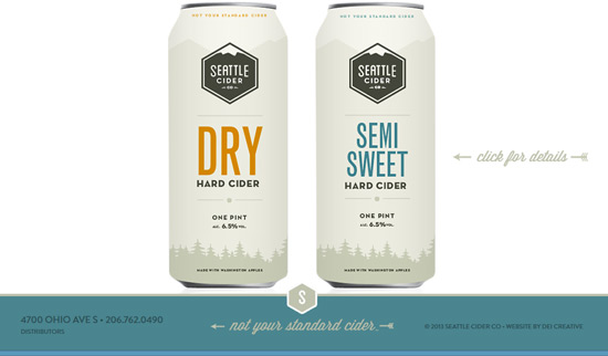
As seen here, use of a sticky footer helps focus on a positive user experience.
Quality content and links
Content should be relative to the business and highlight features that will engage visitors to explore other areas. As with header navigation, we want to guide visitors to areas of the site that will keep them on the right path. Unnecessary information should be avoided and only essential components included such as:
- Contact information, hours, address, and email
- Support numbers
- Small summary
- Quality navigational links
- Sitemaps
- Credits and privacy policies
Although keywords in links may benefit SEO, evaluate what truly is necessary. It’s a general rule to absolutely avoid the over use of keyword phrases, known to many as keyword stuffing. Not only is it an uncreative approach, it potentially offers the risk of being banned by such search engines as Google. So think of your user, do not approach a footer with the means to benefit a SEO plan.
So what should be avoided?
In a nutshell:
- Overuse of keyword phrases
- Large imagery that may slow down site performance
- Too much content, this is what the body of your website is for
Creativity, organization, & simplicity
Visual appeal of the footer should be seamless with the rest of the site. Space should be a strong factor; this allows identification of all the elements included. Typography with a combination of weights and sizes helps clarify links to the user. Busy footers such as eCommerce related websites tend to have the most product related links. It’s good to remember that a cluttered website is not going to help anyone, information should be organized well into its appropriate categories.
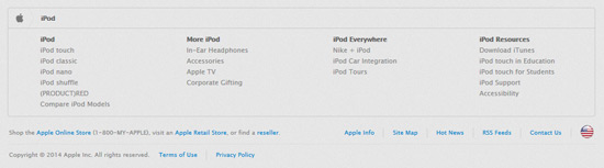
Space can help footers that might have a busy set of links.
Usability
We can add to our user experience by engaging them with useful tools and information, giving your users a mean to return. Gaining interest might be with a combination of the following:
- Contact form or live chats
- Search bar
- Sticky footer
- Social Networks
- RSS Feeds
- Feature blog articles or news
- Newsletter signups
- Return to top
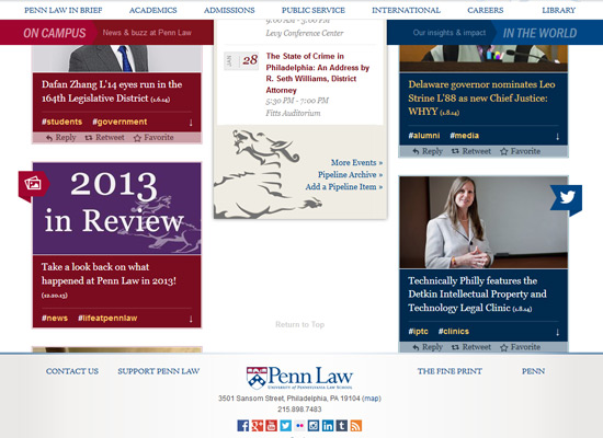
Penn Law makes good use of user experiencing by ensuring both the footer and header navigation work cohesively.
Did I put my foot in my mouth?
Whether a designer or a business who requires a new website, a footer can be an incredibly creative part of your website to connect and drive new interest!

- BY Wayne
- IN SEO, User Experience, Web Design